
What 6.5 million of #coronavirus tweets and Deep Topological Analysis reveal about people’s thoughts during the pandemic
We apply Topological Data Analysis and Deep Learning to a large volume of textual data to reveal hidden patterns in discussions
The problem
Text analysis is a complex task, especially if we’re talking about large volumes of text. Unlike numerical data, text needs to be transformed in ways that require heavy computation and complex models before we can extract any insight.
This information should be presented to users in a simple form for analysis. A user should be able to interact with the platform and understand the data quickly.
In this article I’m covering an example with Twitter data, but the same approach has been applied to user comments, corporate documents or COVID-19 scientific papers.
The solution
DataRefiner was designed as a simple and powerful platform to analyse complex data such as customer activities, sensors in IoT or texts.
At its core is Deep Topological Analysis - a method that unlike traditional business intelligence tools allows to display complex, multi-dimensional data in an easy-to-understand form.
Topological analysis together with Deep Learning and language models like BERT deliver the best results for text analysis. It helps to segment words into themes and shows the links between them.
#coronavirus data
A few months into the COVID-19 pandemic, we analysed 6 556 683 tweets under the #coronavirus hashtag using Deep Topological Analysis (DTA) on the DataRefiner platform. If you’d like to have a go yourself, the dataset — Twitter messages, posted between 8 March and 24 April 2020 in the English language, — can be downloaded from https://www.kaggle.com/datarefiner/65m-coronavirus-tweets-8-march-24-april-2020 (2.08 GB).
Topological Map for 6.5 million tweets
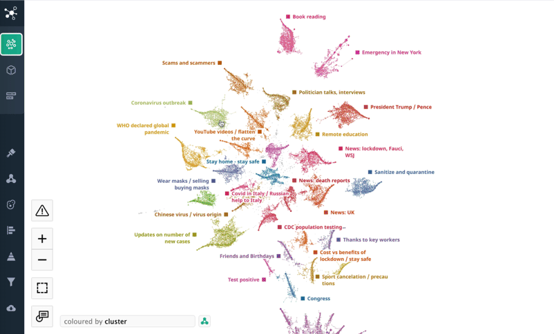
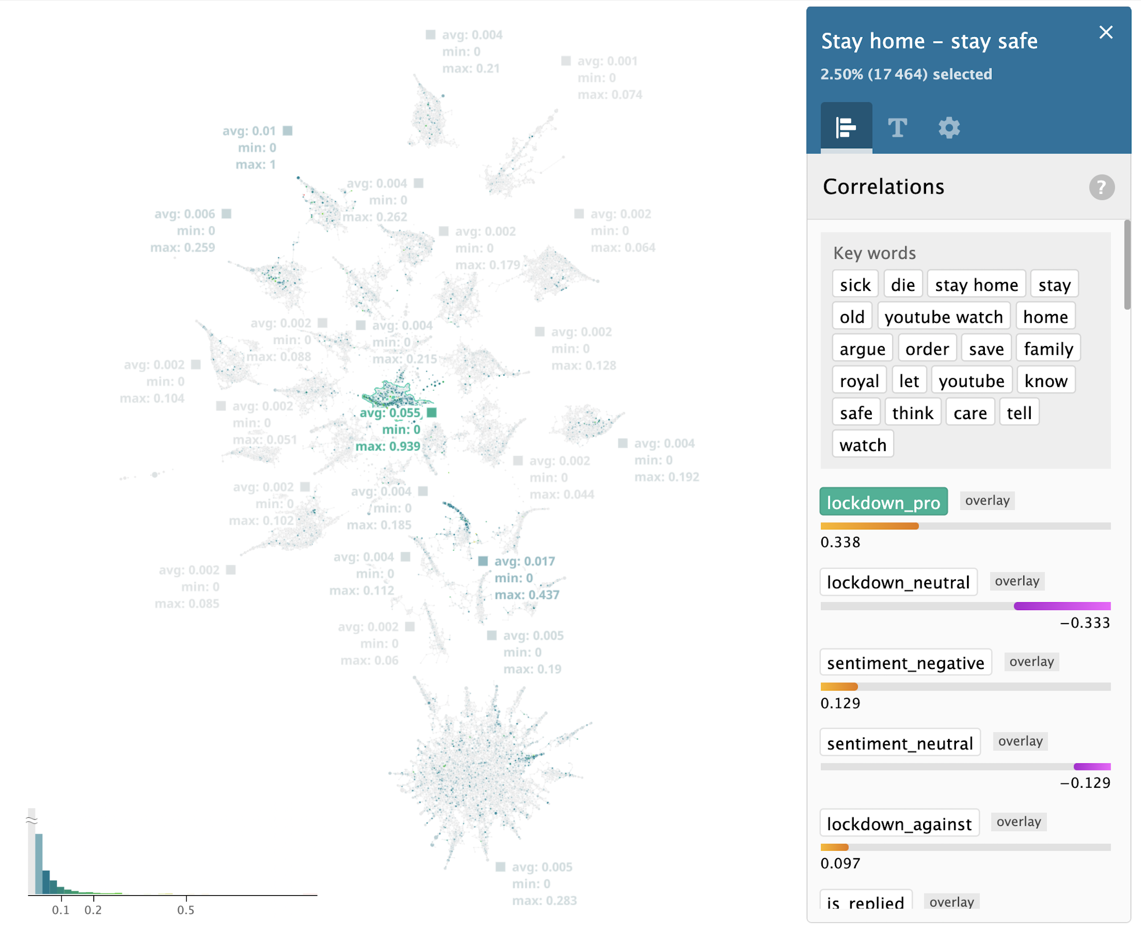
As we uploaded the dataset onto the DataRefiner platform, it automatically created a topological map of tweets where every dot on the map is at least one tweet or a number of tweets with very similar content. While the system segmented the dataset in a completely unsupervised manner, analysts are able to zoom in to a single tweet or cluster of tweets to understand the results better.
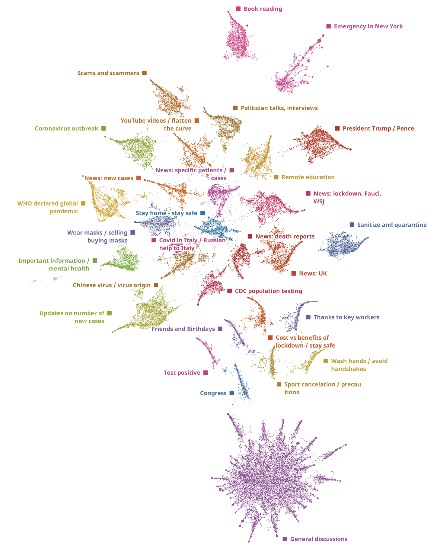
All of the tweets were segmented into 30 main themes that you can see on the map plus 170 themes all grouped in the 'General discussion' cluster. The sizes of clusters on the map reflect the popularity of the topics. Neighbouring clusters have a similar content and keywords. Generic clusters are in the centre of the structure, while specific and unusual content is on the periphery.
The largest cluster "General discussions" contains a lot of smaller themes that do not contain any specific sets of keywords and, thus, are hard to segment.
Retweets
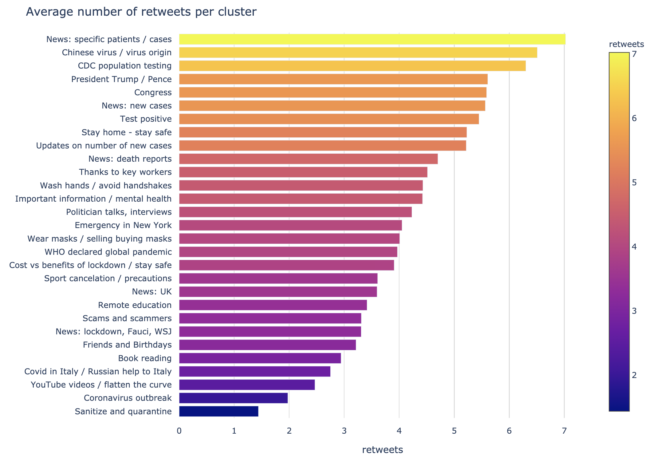
Most retweets are in the "News: specific patients / cases" cluster, which consists of news about Boris Johnson (UK PM) and other confirmed cases.
Sentiment analysis
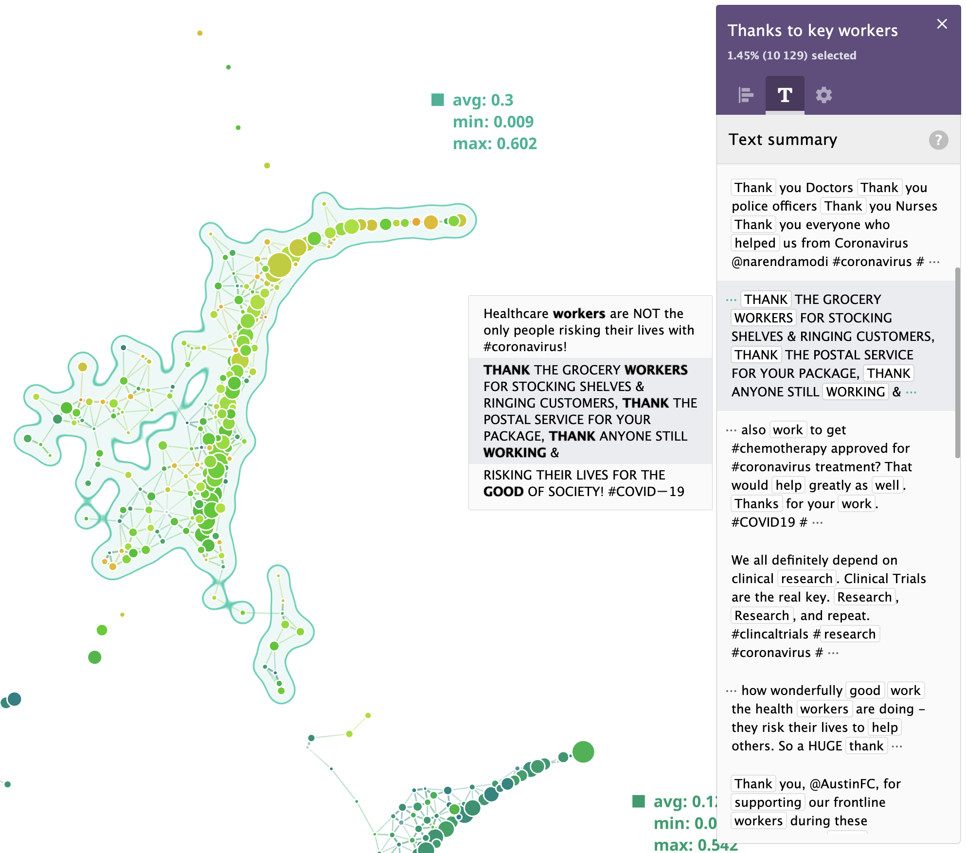
Twitter sentiment analysis is a popular request, and we offer sentiment analysis on the DataRefiner platform. It’s no surprise that “Thanks to key workers” tops the positive sentiments.
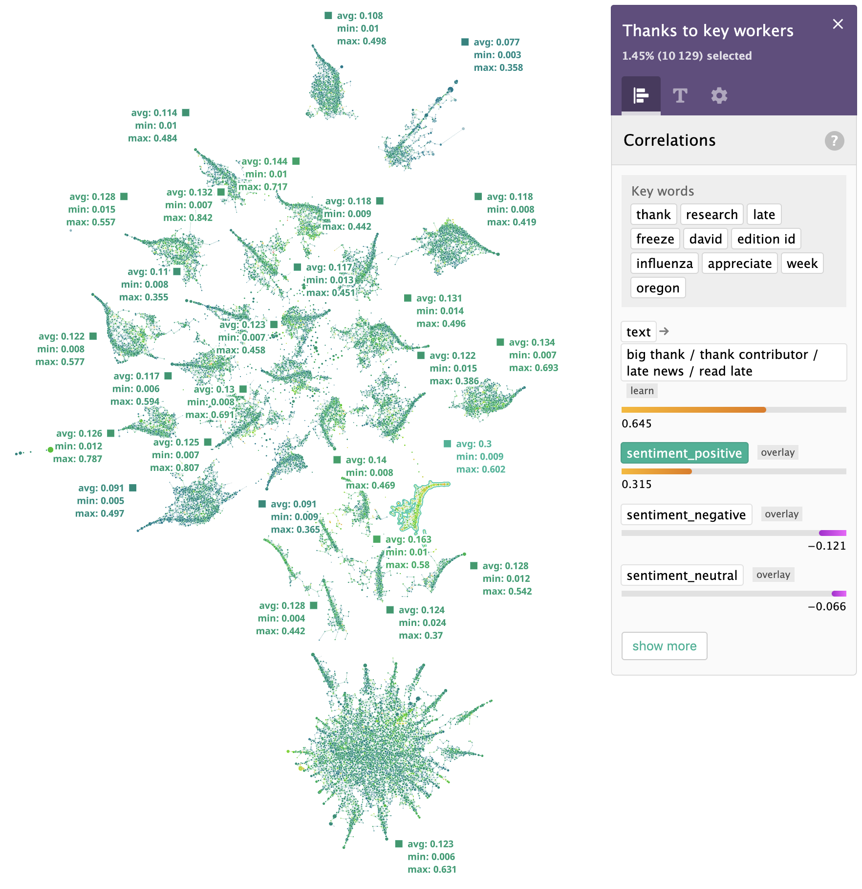
If we zoom in, here's what people said in their tweets:
DataRefiner sentiment analysis provides 3 levels: (negative, neutral and positive). To compare sentiments across all clusters, we plotted the relative positive score on a bar chart. Usually, neutral sentiment is the most common one, so an average positive sentiment value of around 28% is a pretty good result.
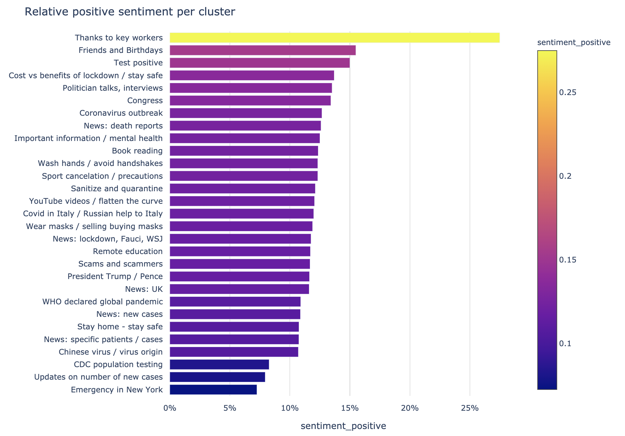
Unfortunately, or perhaps as the topic of COVID-19 dictates, the level of negative sentiments were significantly higher than the positive ones.
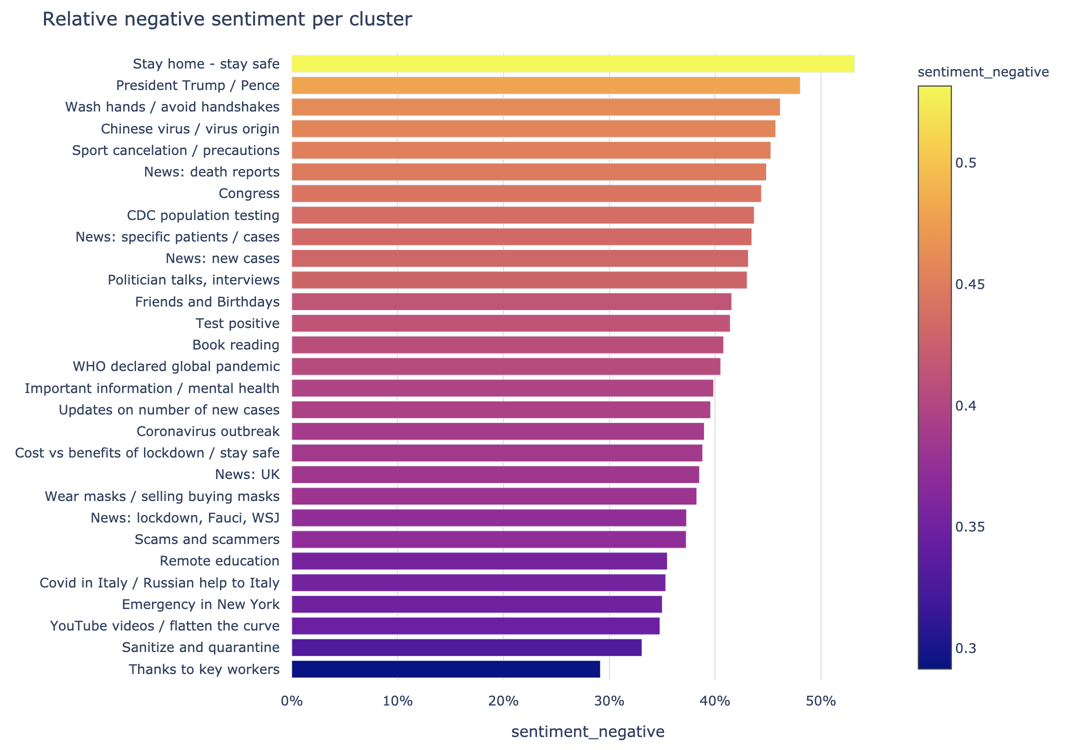
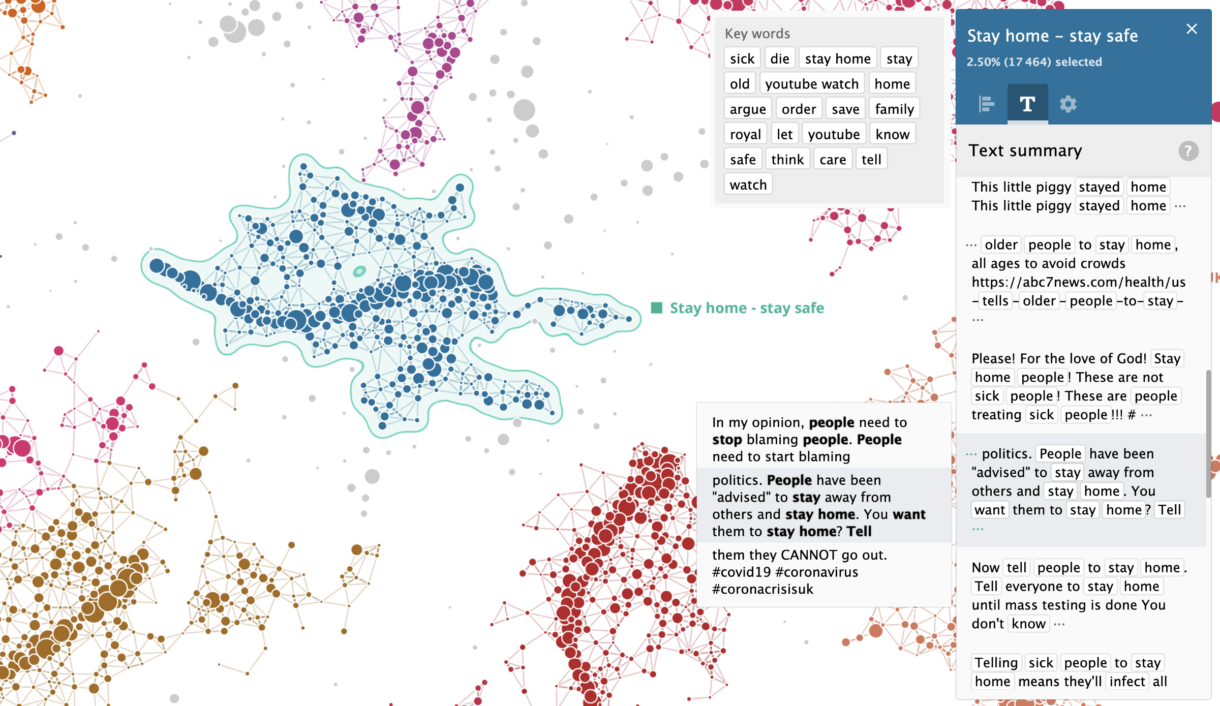
Stay home - stay safe
'Stay home - stay safe' theme emerged at the top of the negative sentiments. One of the reasons is multiple comments by people blaming others for breaking the lockdown rules. Also it looks like the system picked up a passive aggressive tone of pro-lockdown messages by some commentators.
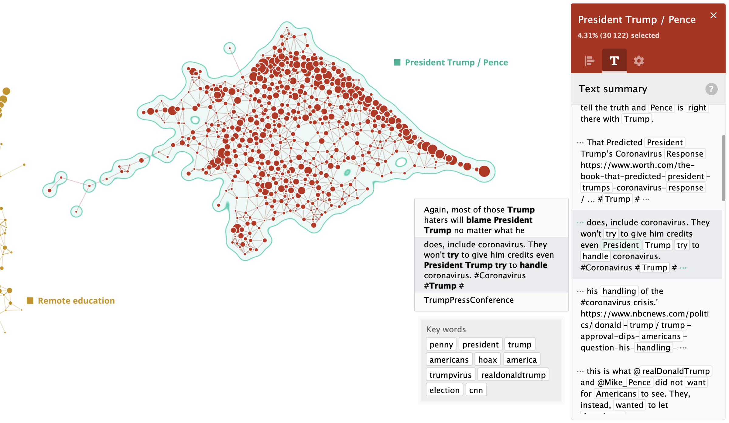
President Trump / Vice President Pence
There are often heated discussions around President Trump. It can be either liberals blaming the government or conservatives blaming liberals. Either way, it always gets very messy:
Pro lockdown / against lockdown discussions - active learning case study
In this analysis we wanted to find out how many people were pro lockdown and how many were against.
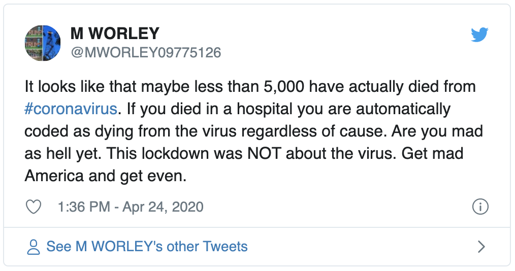
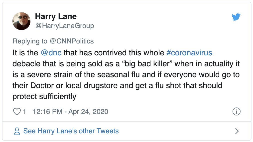
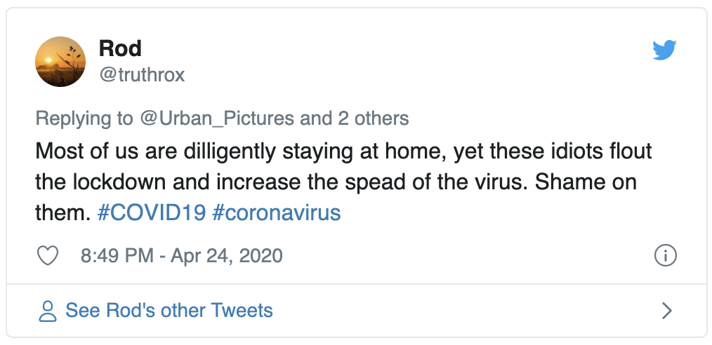
Here are a couple of example tweets against lockdown:
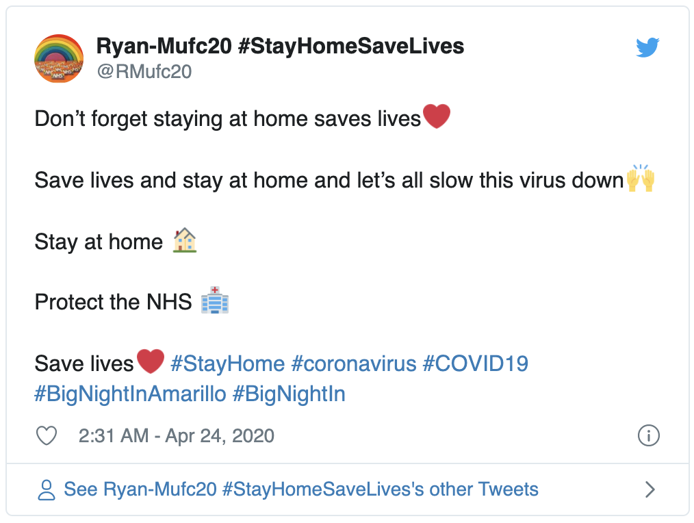
Examples pro lockdown:
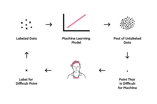
Active learning
As you can see from the tweets above, the language in these examples can vary a lot. In reality there are much more vibrant discussions going on on this topic. It would be impossible to distinguish these two classes using just topology and clusterisation, so I used supervised machine learning.
To speed up the process I used an active learning approach:
- users add labels to a number of initial samples;
- the classifier learns the model and applies it to the rest of the data;
- the classifier identifies new samples which it is most unsure of and asks the user to classify them.
This process repeats until the model has learned a good representation. This approach helps users to focus on the most challenging samples and speed up the training. Here a diagram to explain the approach:
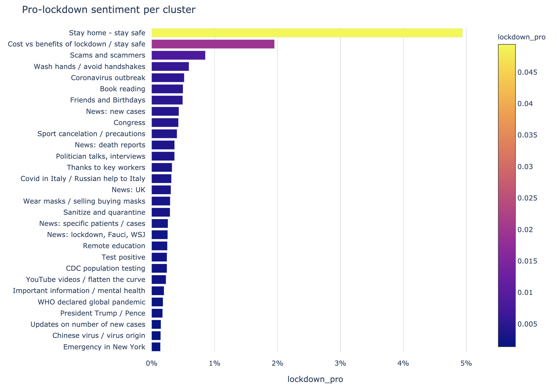
Results on the map
To our surprise, most of the pro-lockdown discussions happened in the “Stay home — stay safe” cluster, which we’ve discussed previously. In this case the topological approach was able to automatically identify language related to pro-lockdown in an unsupervised way:
To prove this we can plot it as a bar chart per cluster:
… and, for comparison, the graph relating to tweets against lockdown:
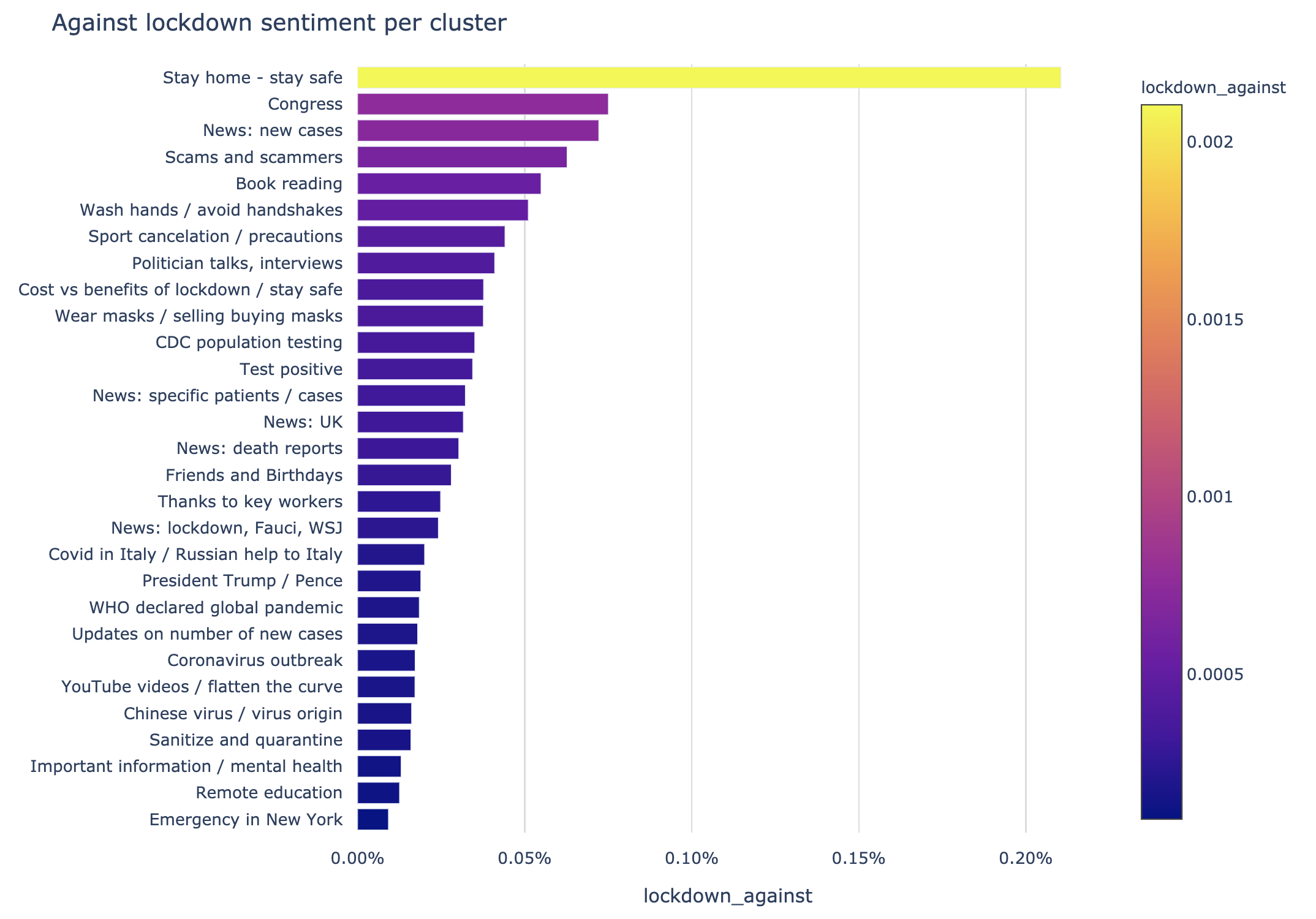
Please note, the scales of the axes of these plots are different. Contrary to popular belief, there are significantly less tweets against lockdown versus pro-lockdown, almost 1 : 20. Tweets against and pro-lockdown are grouped at the same cluster “Stay home — stay safe” as mentioned before.
Discussions over time
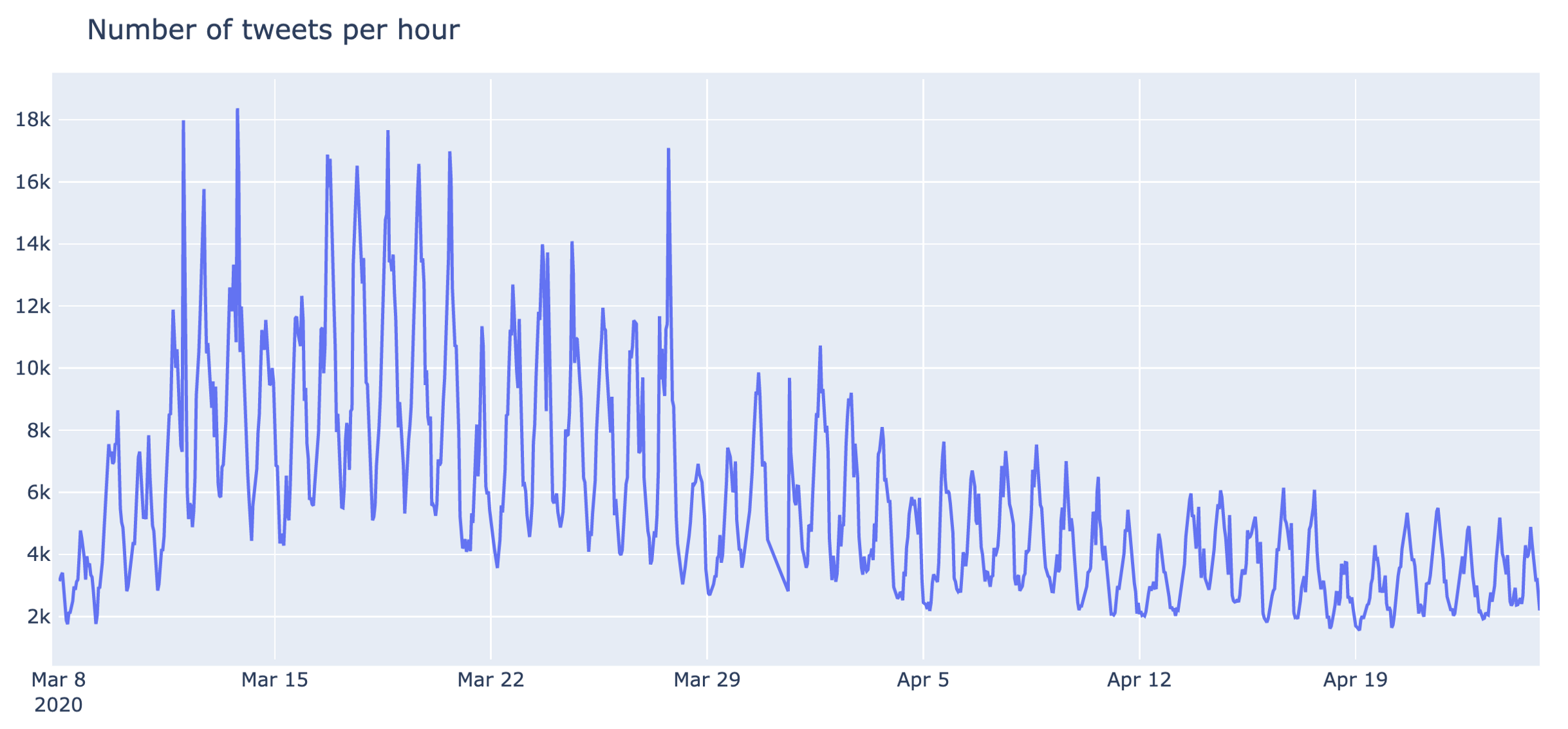
Another important part of this research is to identify trends per cluster and how they change over time. In this part we remove cluster “General discussions” from the analysis and focus on the main themes, extracted by our topological structure. A stacked area chart of these discussions is below:
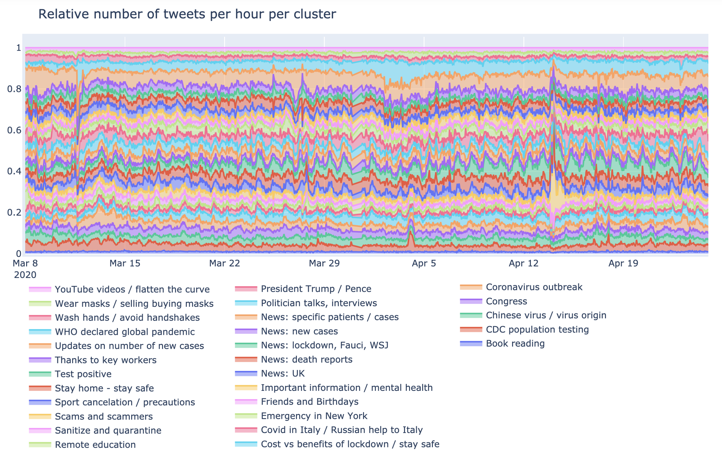
This is the relative number of tweets per cluster over 1.5 months of data for all 30 clusters. You can see there are a lot of spikes in discussions. Below is an alternative view as a line chart with the highest spikes annotated:
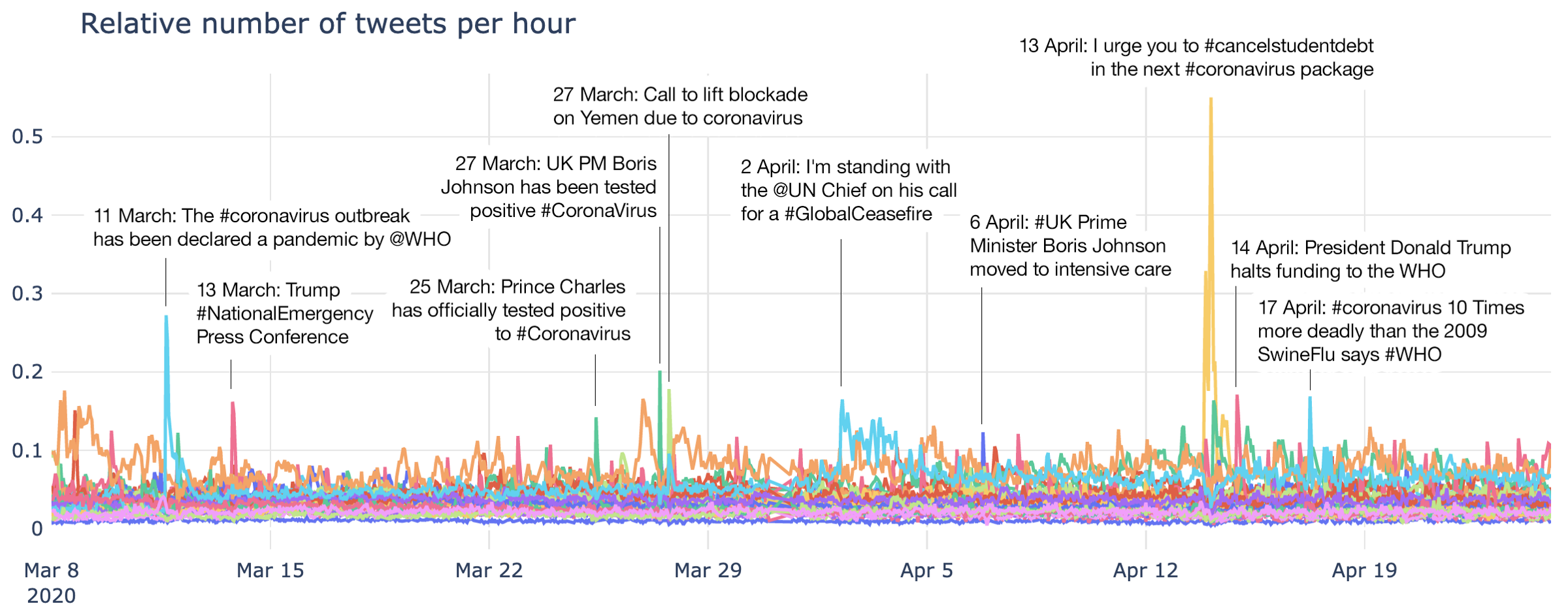
There is a lot going on here, so let’s review some of these clusters separately.
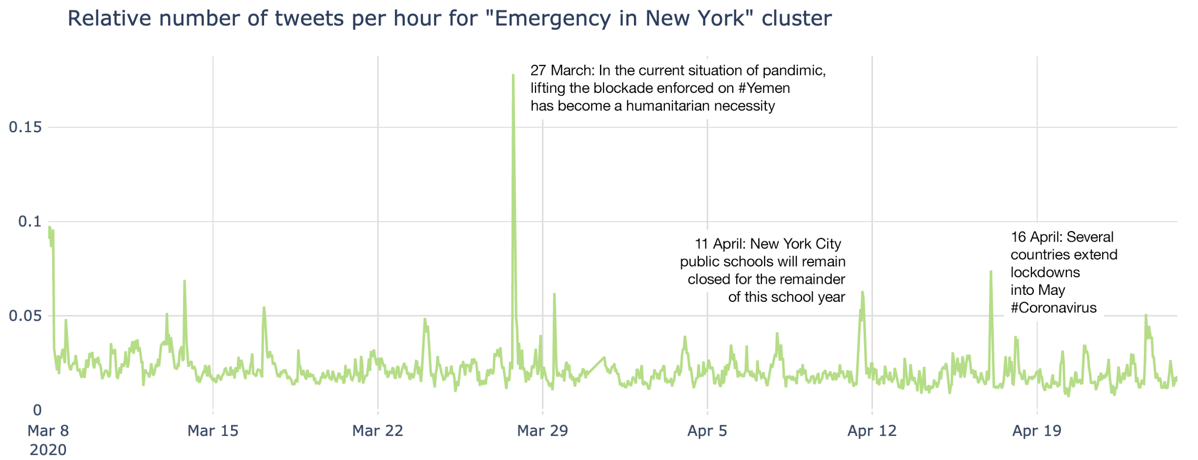
As well as the cluster called “Emergency in New York”, there are other emergencies captured here. One of them is a significant spike in relation to lifting the blockade in Yemen:
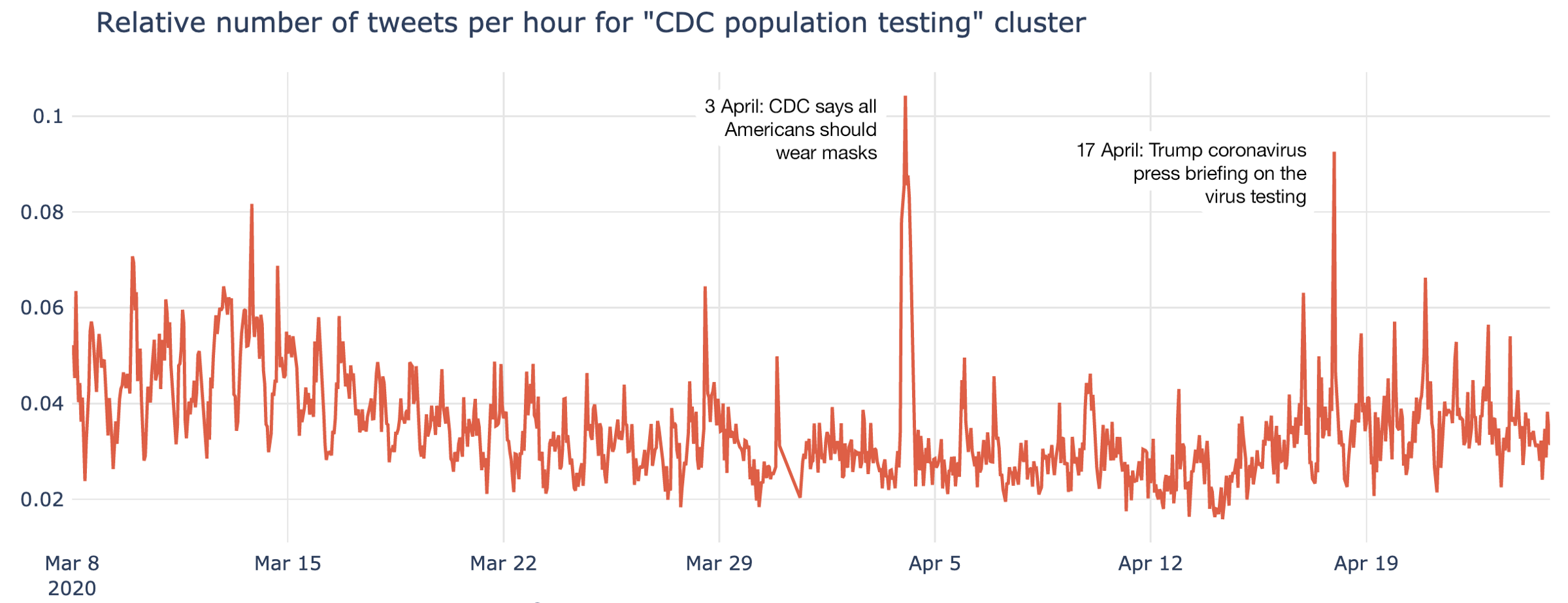
CDC (Centers for Disease Control and Prevention) in the US played a major role in public communication and tackling the crisis:
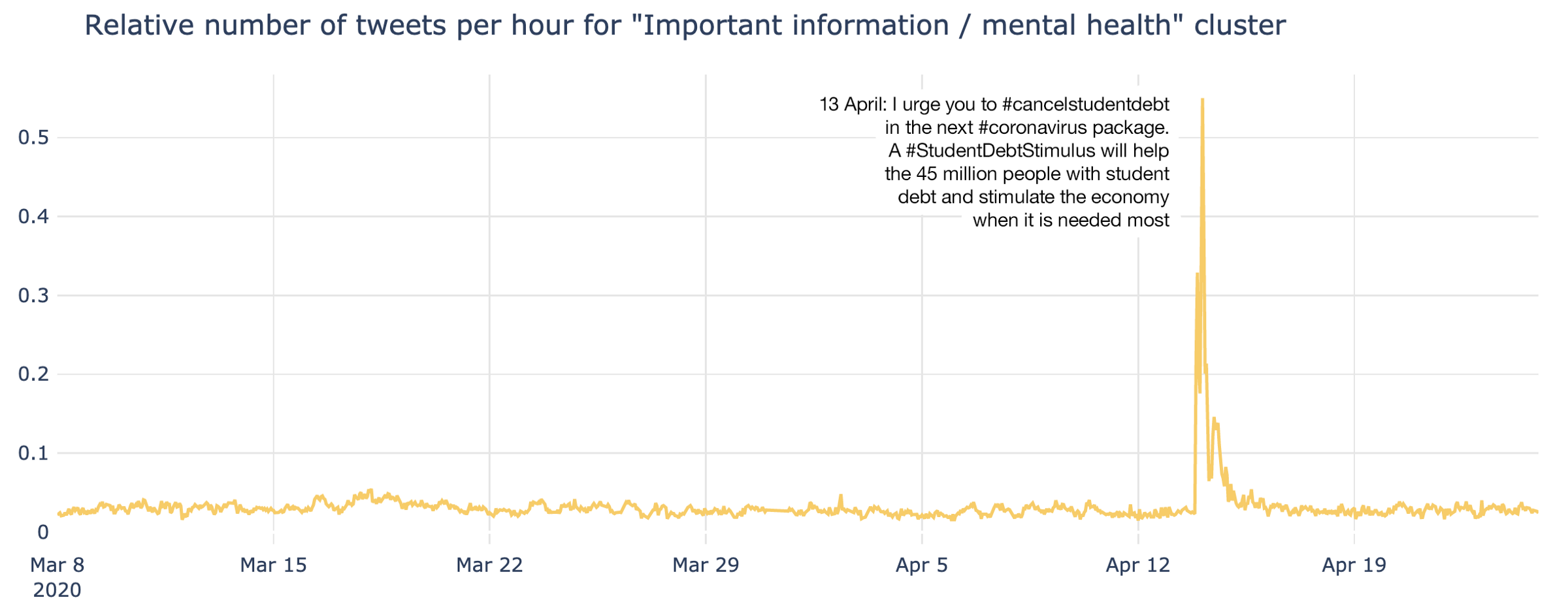
Most of the time discussion of mental health was relatively muted, however for a few hours there was a noticeable spike of discussion, linked to the it #cancelstudentdebt hashtag. This represented the most prominent spike across all clusters throughout the entire period of analysis:
WHO (World Health Organisation) is part of the United Nations, and played a significant part during the pandemic:
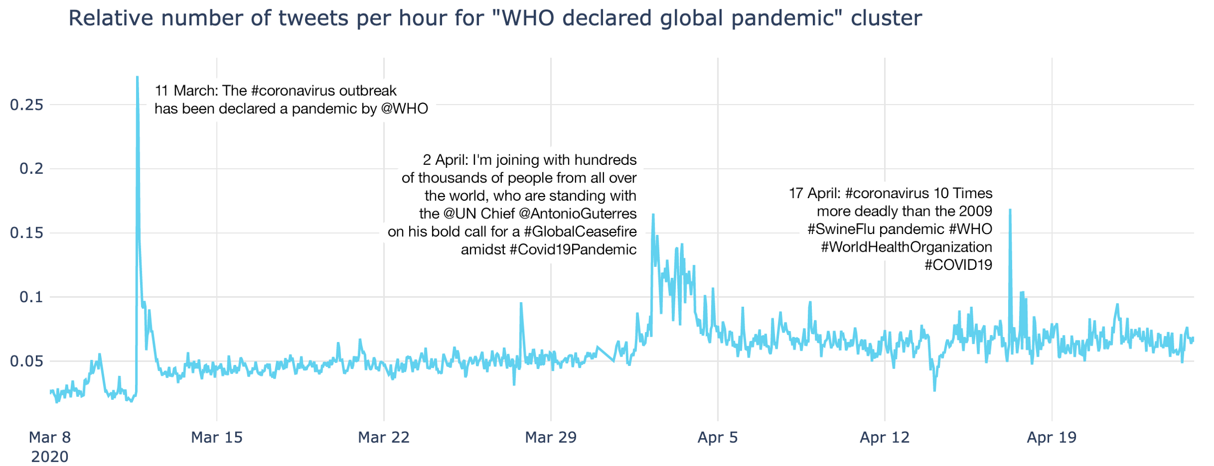
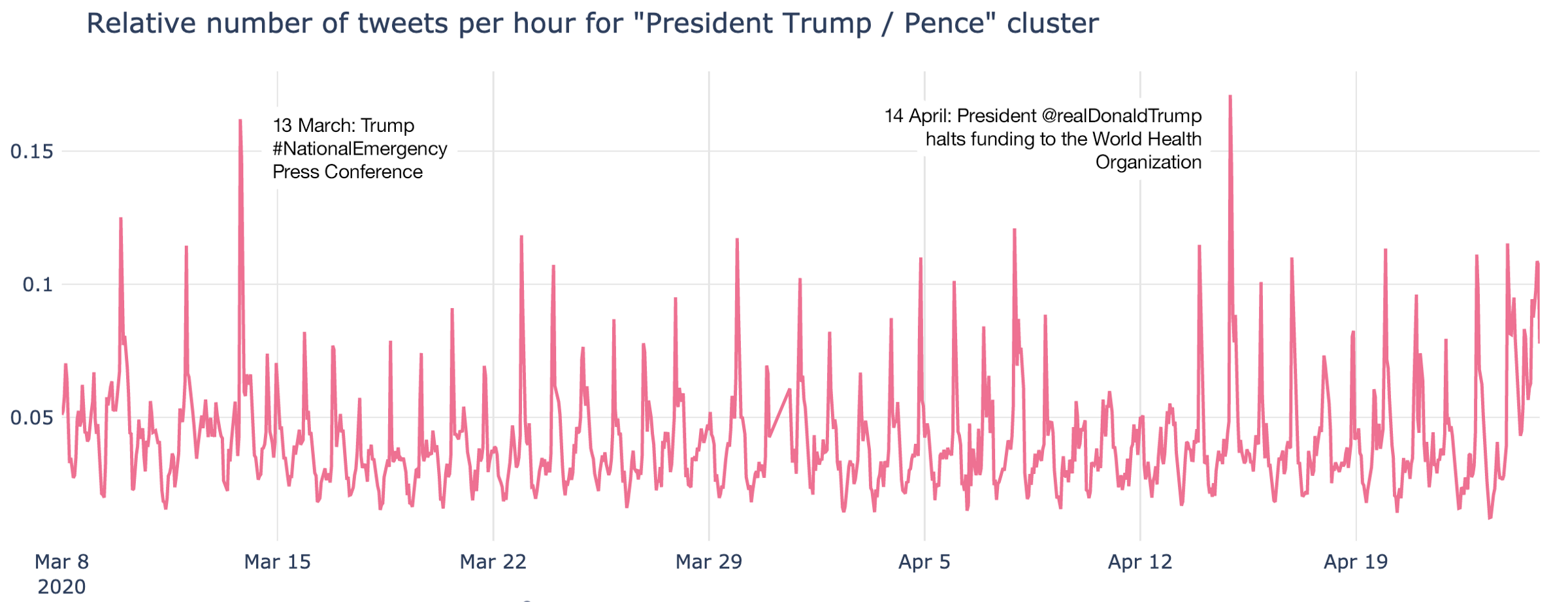
The discussions related to WHO and UN actions were reflected in many other clusters, but most overlaps were within the “President Trump / Pence” cluster. Trump is always in twitter discussions and there are a lot of trends and subtopics going on here. I’ve highlighted the two most important ones:
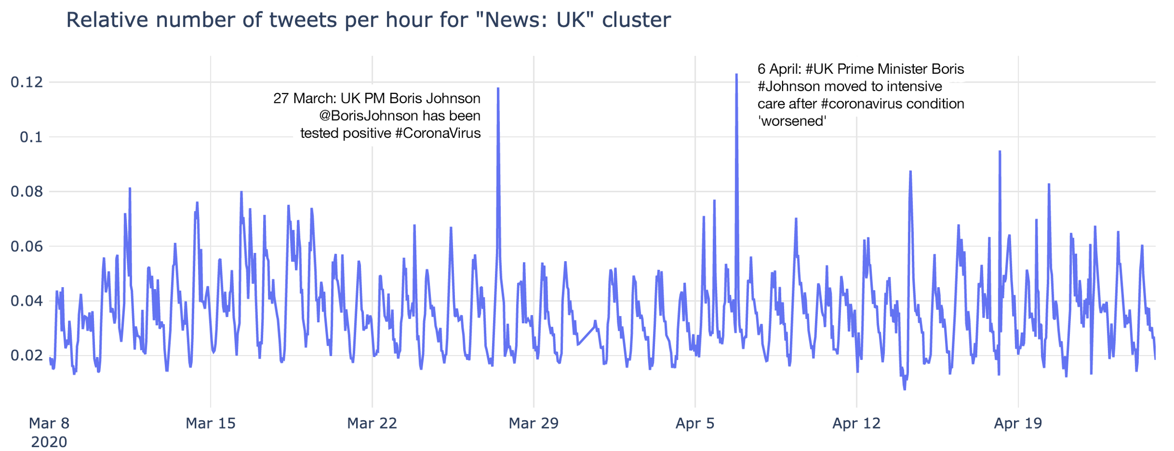
The most important activity spikes about the UK are both related to Boris Jonson being tested positive and later his hospitalisation and intensive care treatment:
Conclusion
The emergence of modern Natural Language Processing and Deep Topological Analysis allows us to have a new look on the popular task of Twitter data mining. Text data holds a lot of information and it’s important to allow users to access it and to understand it.
There is no other approach on the market, which allows users to process this volume of data and at the same time provide such visual fidelity for analysis of these complex data sets. This technology is proven to give exceptional results for many industries.
****
DataRefiner.com is a UK based company that specialises in analysis and segmentation of complex data like user activity, sensor or texts. The DataRefiner platform is the result of many years of refining approaches discussed here, but is applied across a wide variety of industries, including aviation, social networks, fraud detection and more. For more information regarding your industry, contact us on ed@datarefiner.com